DEUTSCHE TELEKOM
MagentaTV is Deutsche Telekom's TV solution, delivered via internet, bundles conventional TV, media and video libraries, streaming services, and exclusive content on a single platform. Boasting some 300 TV channels and more than 100 HD channels, MagentaTV offers customers not just a comprehensive range of programs, but also Germany’s biggest HD package. Selected UHD content creates a brilliant television experience.
It includes the new access to the video-on-demand offerings from Videoload, Telekom Sport, MagentaMusik, and Deutsche Telekom's pay TV offerings.Features like time shift, restart and voice remote control provide unparalleled convenience. MagentaTV is available via app for iOS and Android, as well as on Chromecast and via web client.
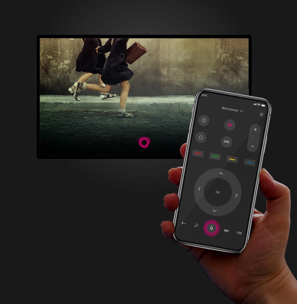
Image from Deutsche Telekom
01
MY ROLE
During the period of one year, as a UX designer I worked on both web and mobile app projects, tackled the complex tasks and transformed them into intuitive, accessible and easy-to-use designs. I worked closely with external designers, product owner, business analyst and engineers.
02
THE CHALLENGES
There are so many nice visualizations of voice settings interfaces on Dribbble and Pinterest. Many of them are pleasing looking animations that would not work in reality. They do not meet user needs and business objectives.1. The current remote control needs a solution to add buttons from a physical (G4) remote control .
- fast forward
- rewind2. Mobile solution needs to cater for the smallest resolution to tablet size.3. Based on user research result, incorporate a design solution to meet the users need.
03
PROJECT GOALS
The goals of this project was very clear:1. Update new buttons into the current voice remote control mobile app.2. Find out other essential and non-essential buttons based on quantitative usability studies.3. Consider all elements to fit into the smallest resolution.
04
USER BEHAVIOUR
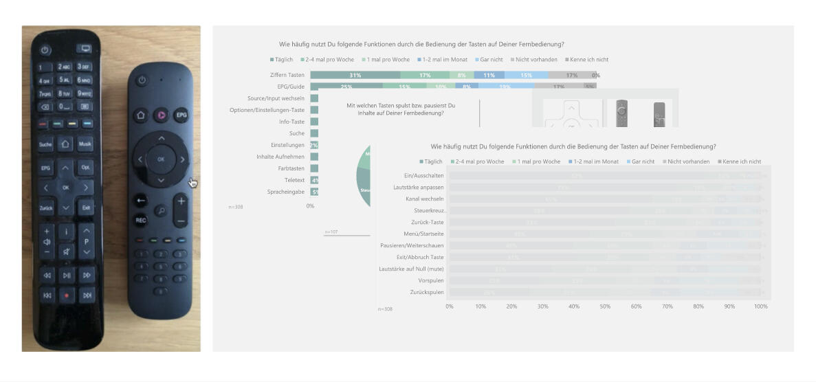
Usability studies reportUsers were surveyed on to get a general understanding of how they use the remote control to access the TV content. Based on quantitative results, users stated they frequently use play/pause, fast forward, rewind and mute buttons on a daily basis as well as those of less frequent usage.Physical remote controlUsers are familiar with the positioning of frequent used buttons. Therefore the remote control is used as a guide for new buttons placement.
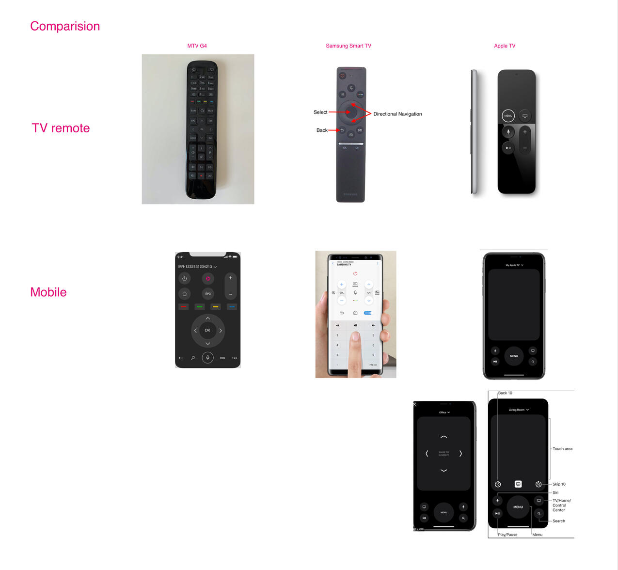
Competitors researchWe also look at other remote controls in the market.
05
DESIGN SOLUTION
The NEW design was crafted with these new improvements:- Upon tapping on the colour button, an overlay with bottom sheet will display the four coloured button respectively.- Users can now use the full volume feature include the mute button.- Users can navigate easily for the most common used <play/pause>, <rewind> and <fast forward> buttons.
BEFORE
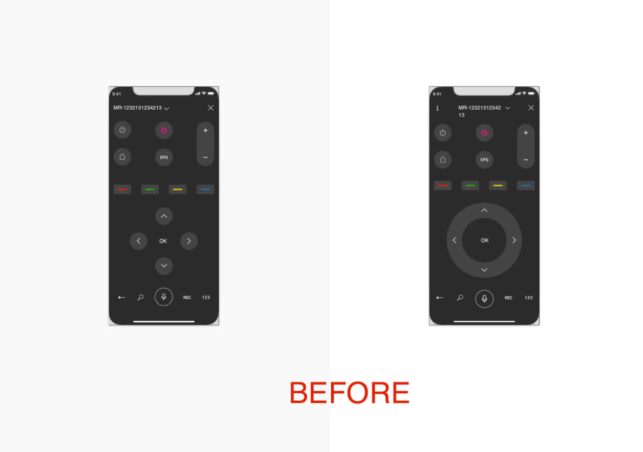
AFTER
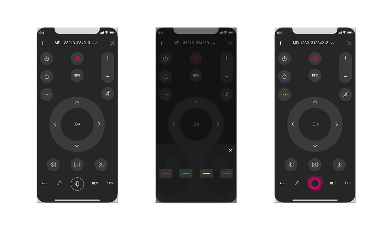
The iOS 375px mobile.
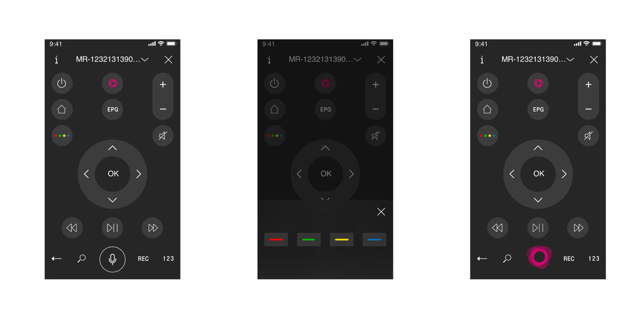
The iOS 320px mobile.
06
NEW DESIGN
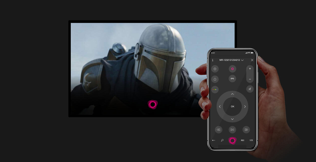
Design used for the onboarding.
Cindy Lin-Tschoeke | UX, UI & Visual Designer | [email protected] | Last updated in 2021